"TKC 100" logo I designed my first year on staff. 2017–18 was the year of the Call's centennial volume.
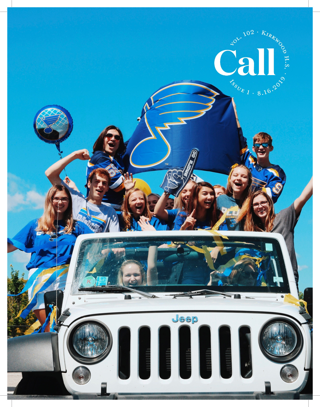
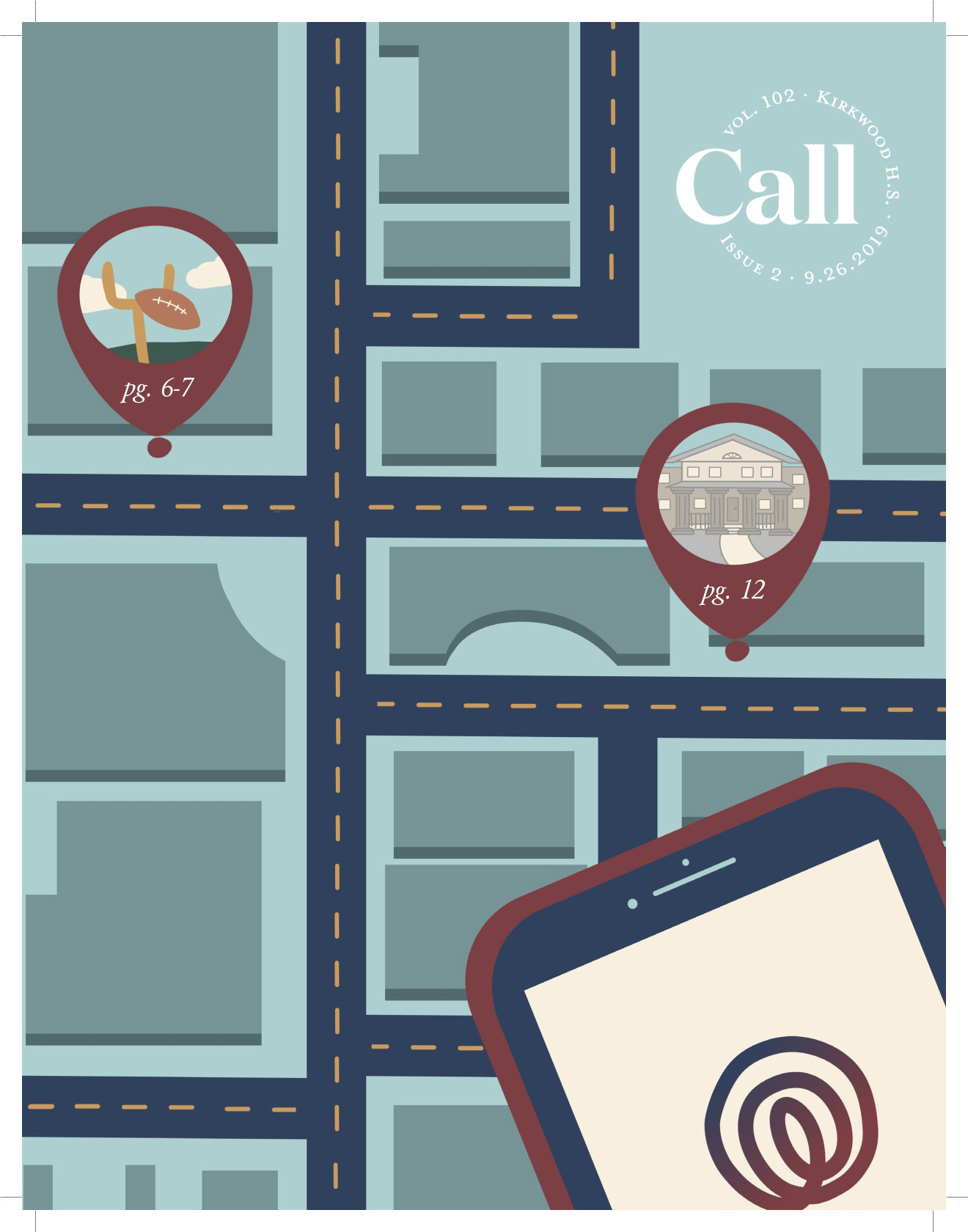
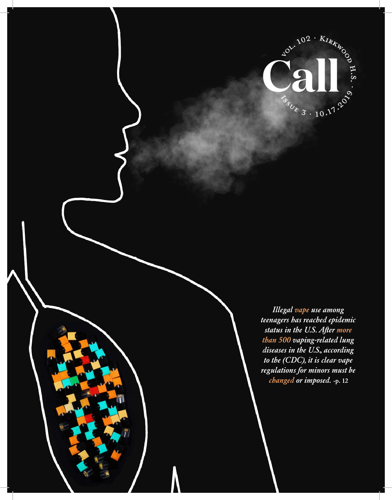
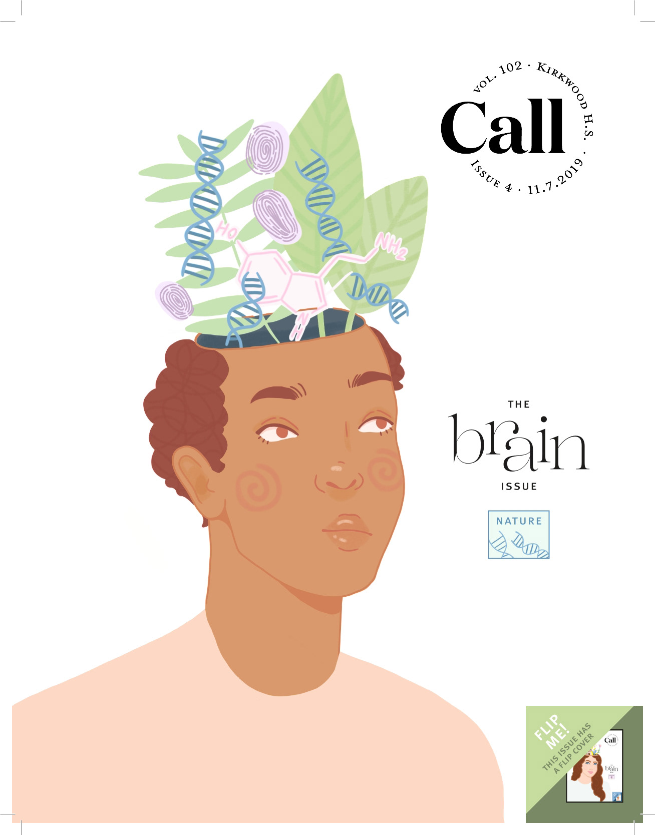
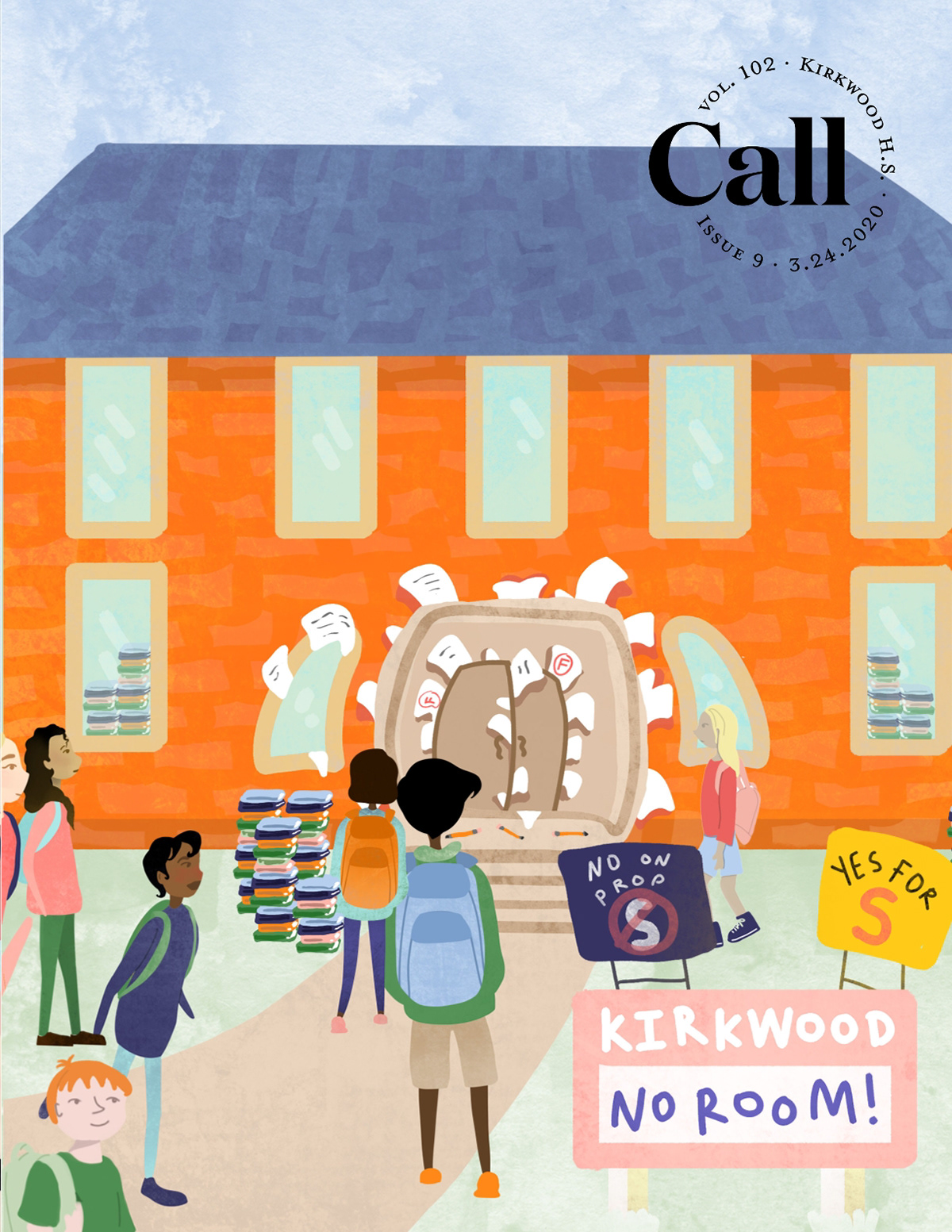
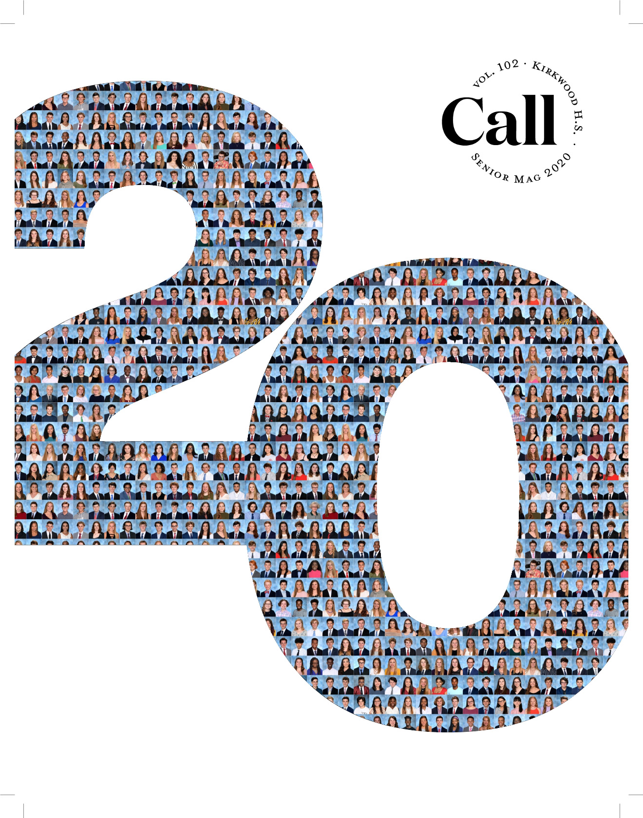
As Design Editor of The Kirkwood Call, my high school's award-winning newsmagazine, I led the visual direction of each issue — overseeing layout, typography, and overall production quality. When I stepped into the role, the position had been inactive for several years, so I worked to re-establish consistent design standards and a cohesive editorial style.
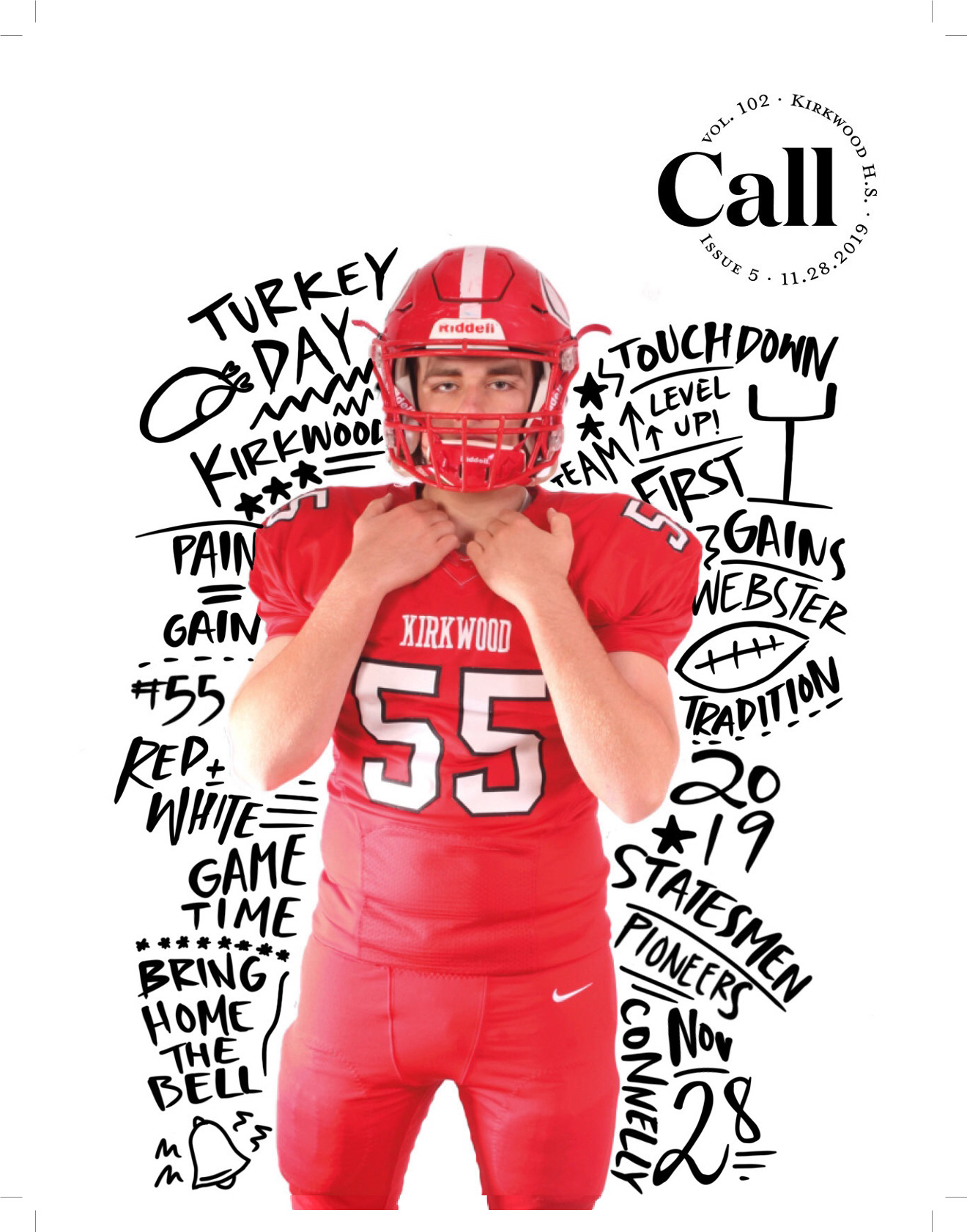
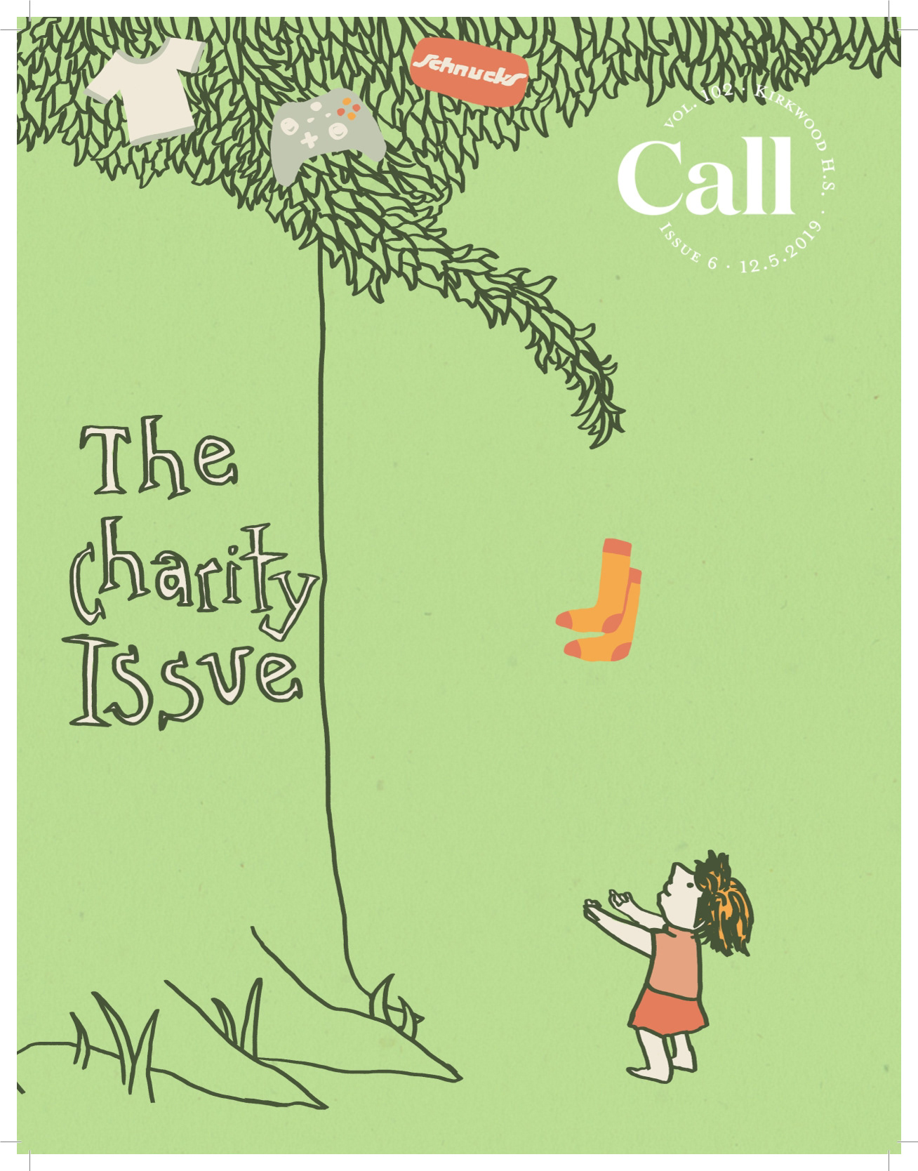
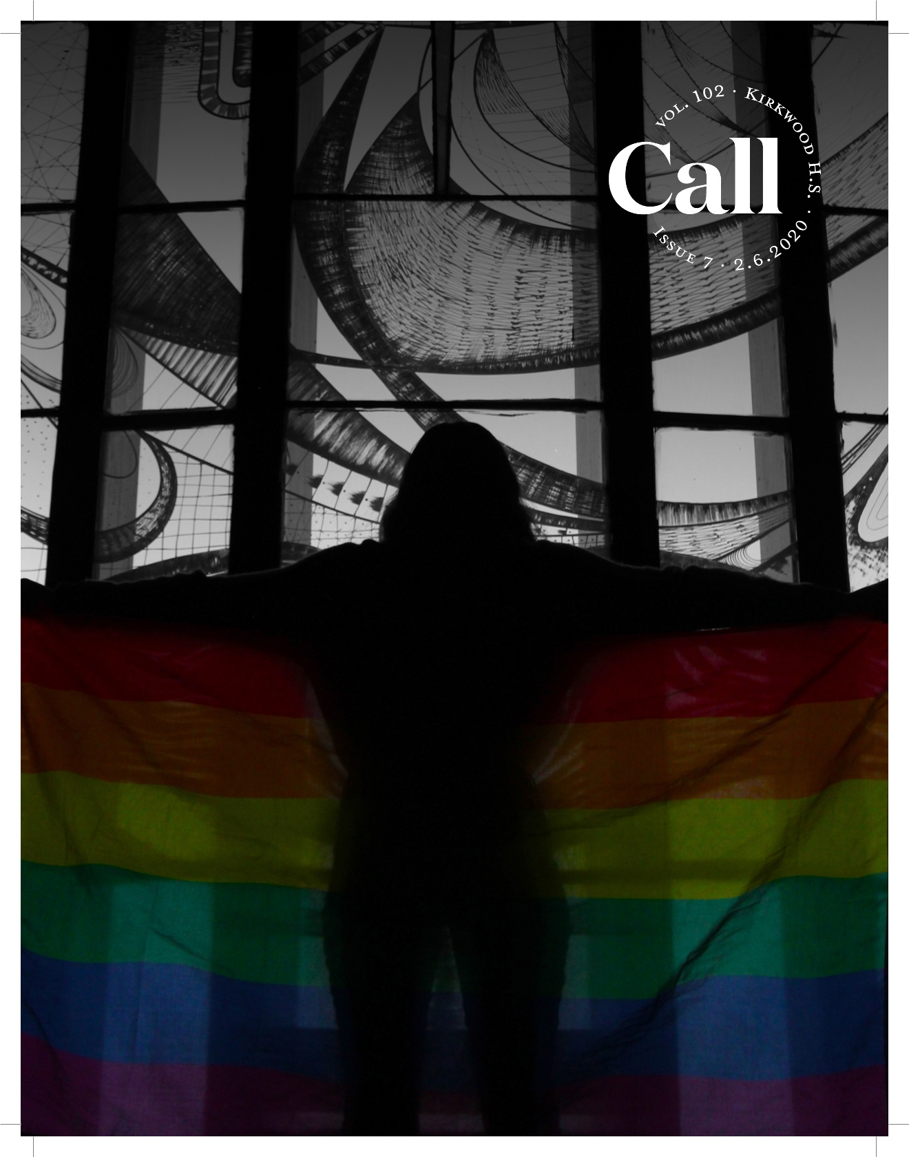
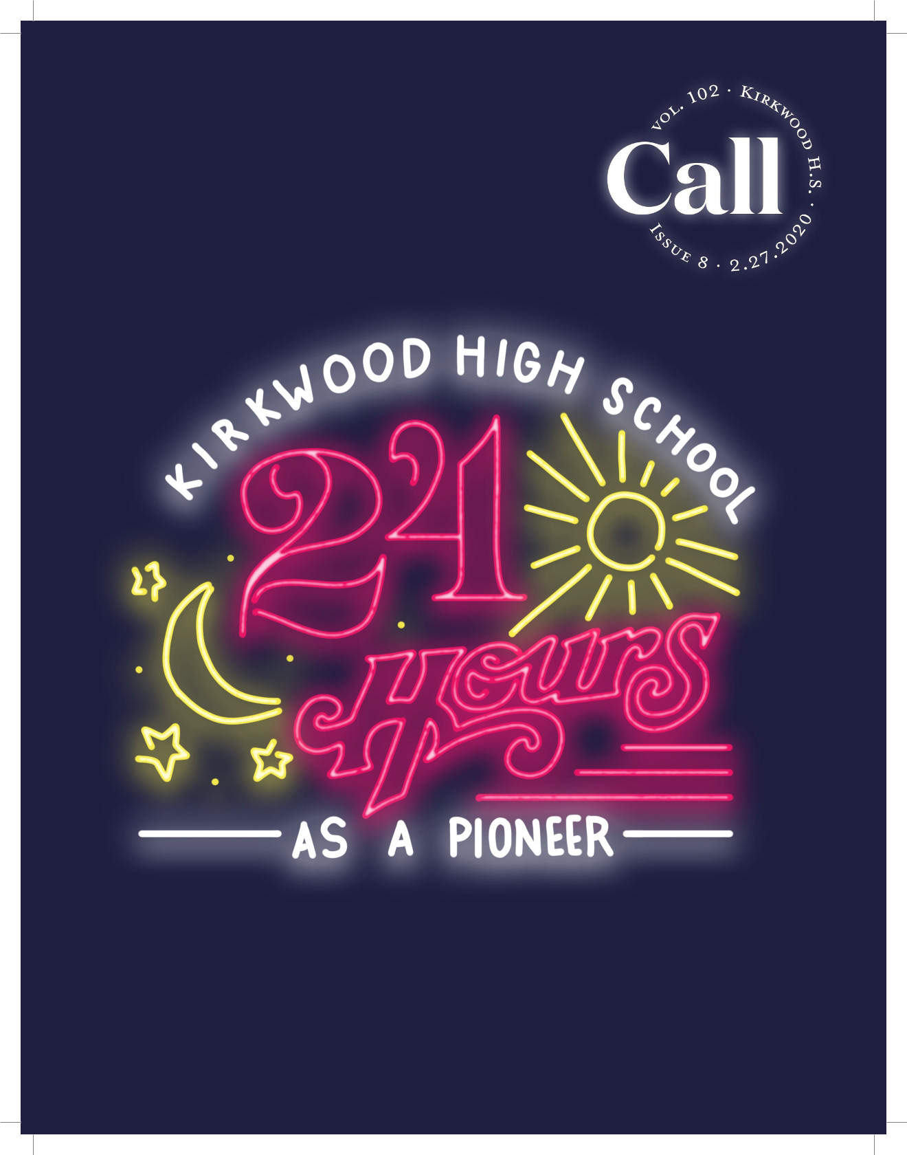
My responsibilities included designing and refining feature spreads, section templates, infographics, and cover layouts, ensuring that each story's visual presentation supported its tone and message while integrating harmoniously into the rest of the issue. I also collaborated closely with writers, photographers, and artists to create designs that were both bold and readable, balancing creativity with journalistic clarity.
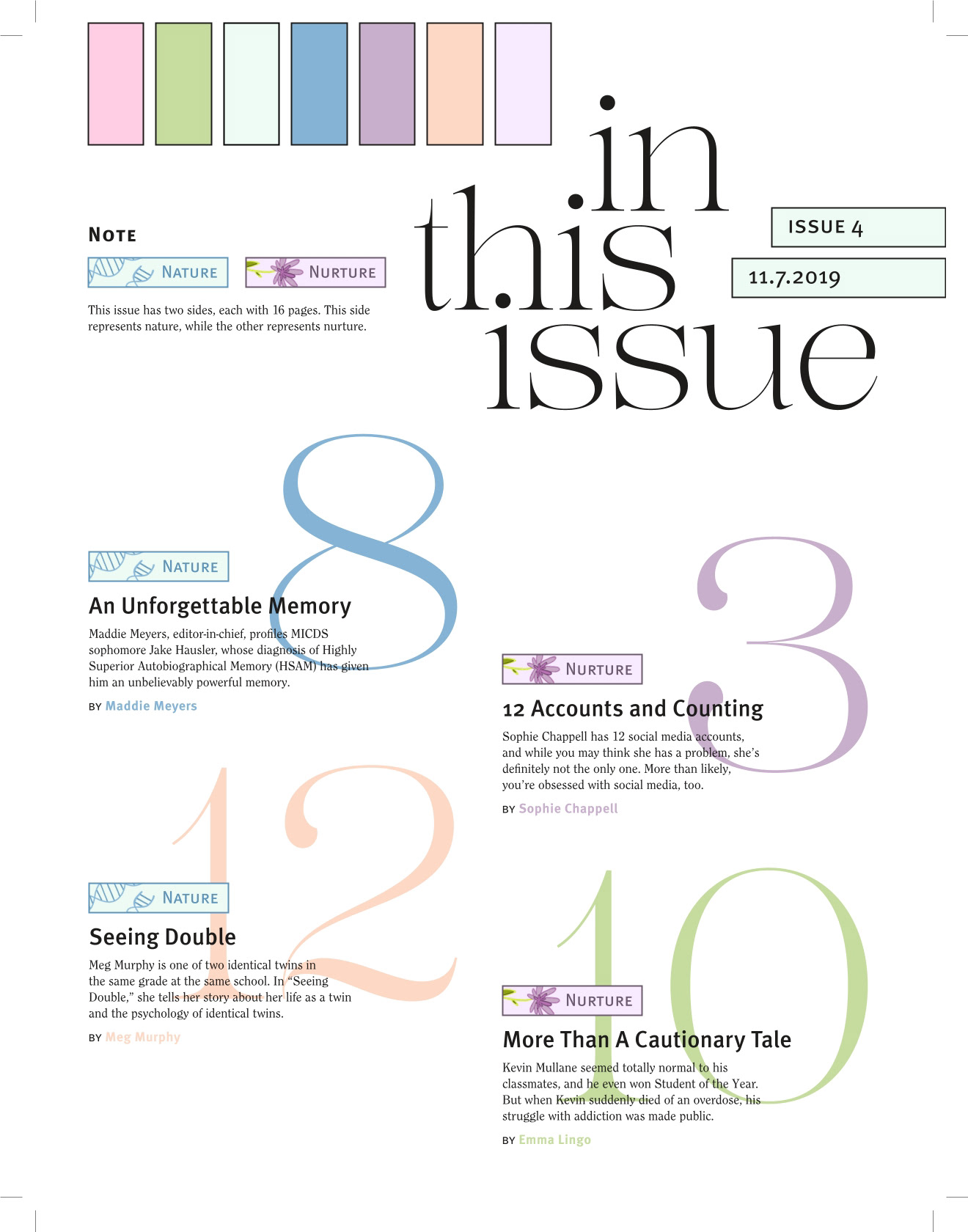
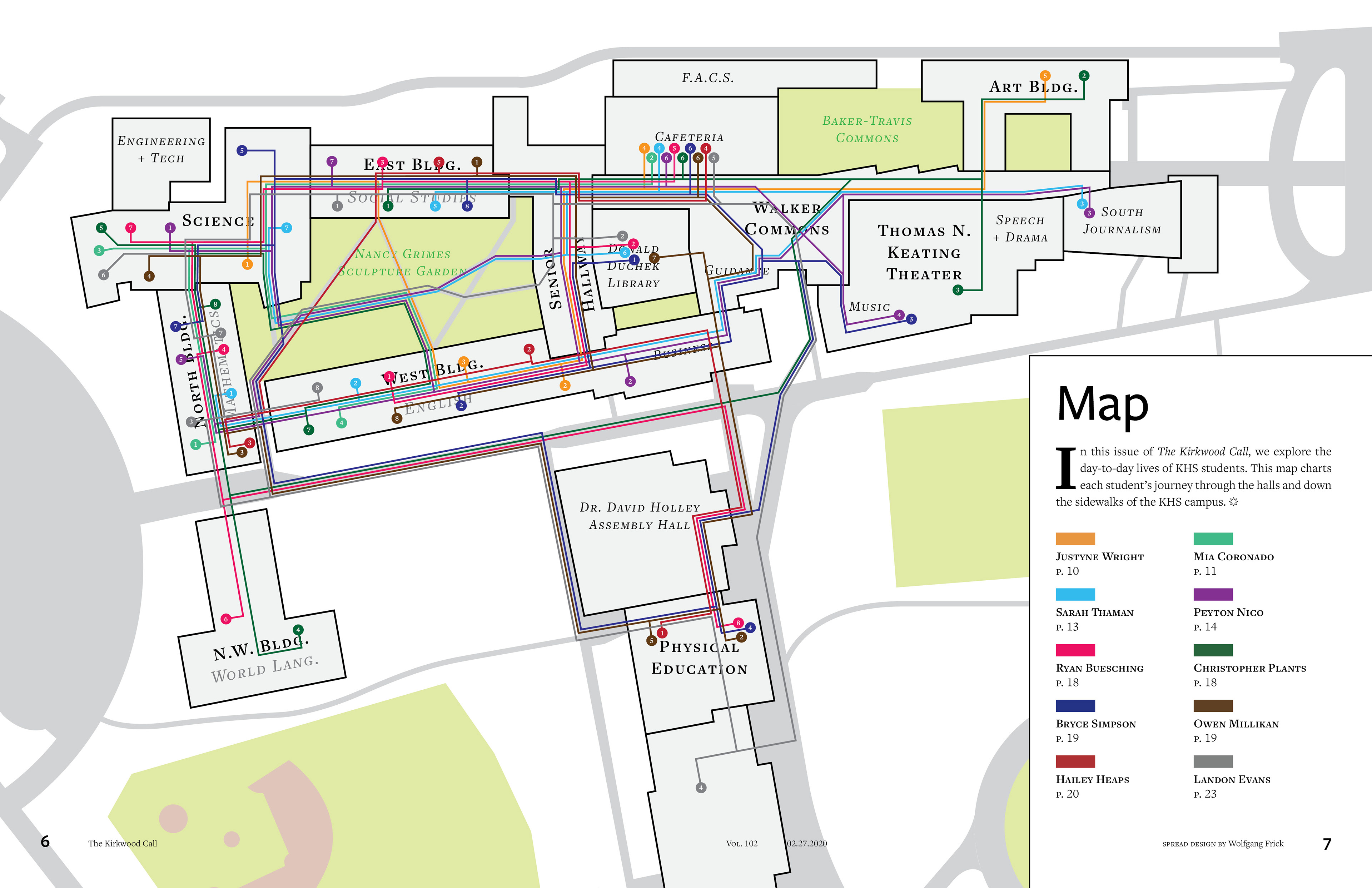
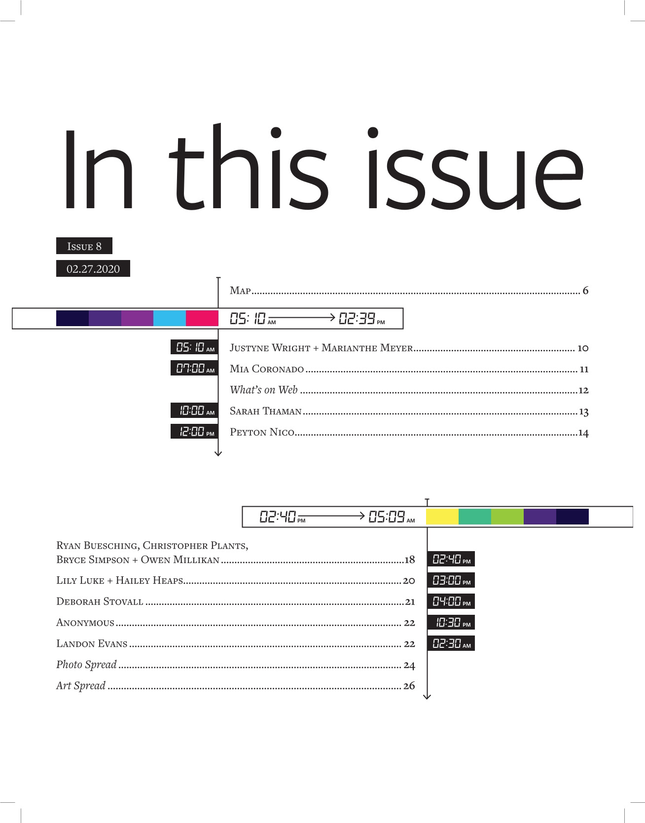
Among the most notable layouts are the map spread from a special issue on the day in the life of a typical KHS students. I mapped each profiled student's daily routes through campus, which also highlighted the foot traffic patterns through campus. Another of my contributions were the contents pages, whose layout changed from its default to fit in with the design of the special issues. These pages demonstrate my early experimentation with visual hierarchy, typography, and narrative flow — skills that have shaped my later design work.
2017–2018 mark.
2019–2020 mark.
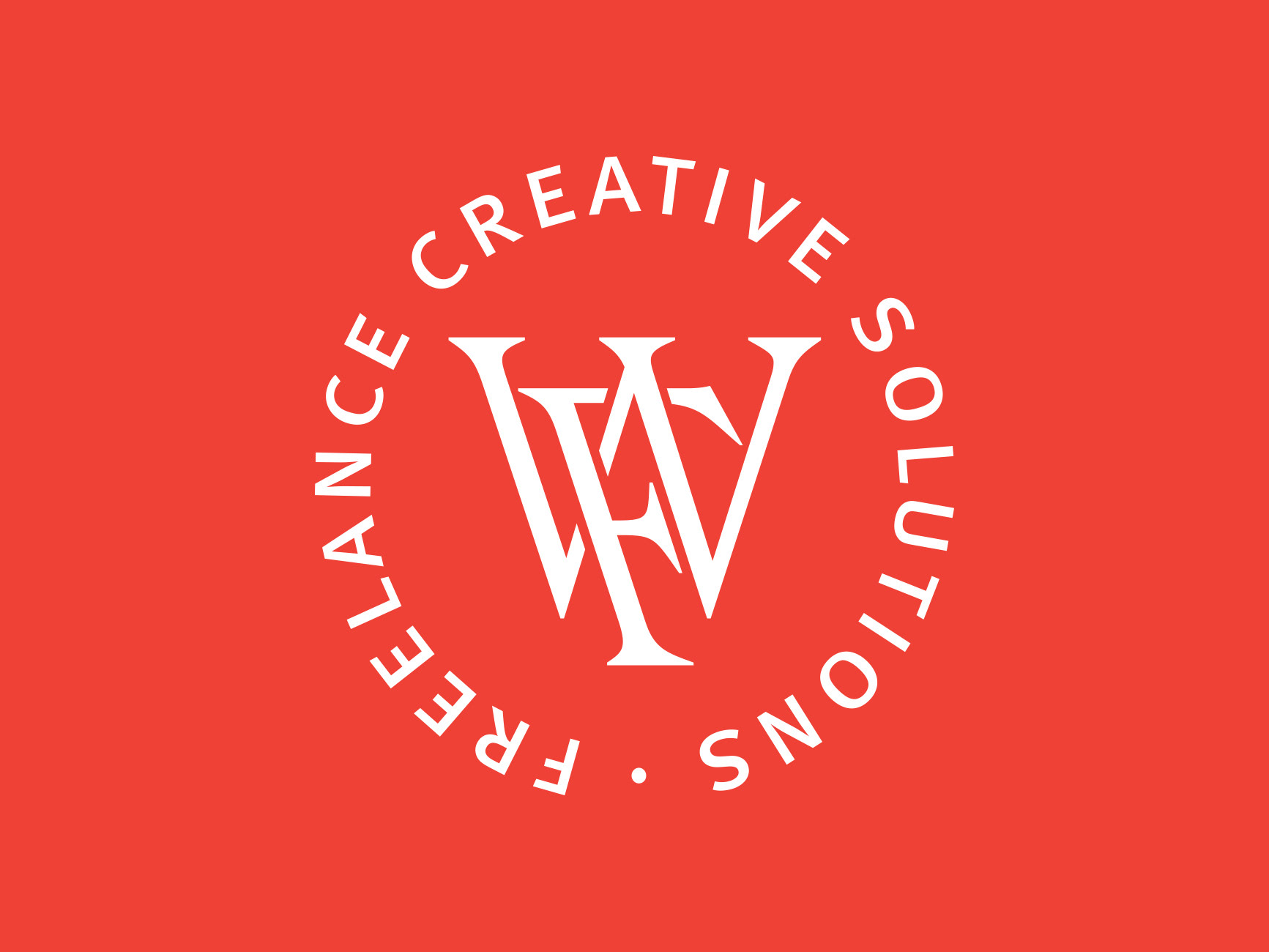
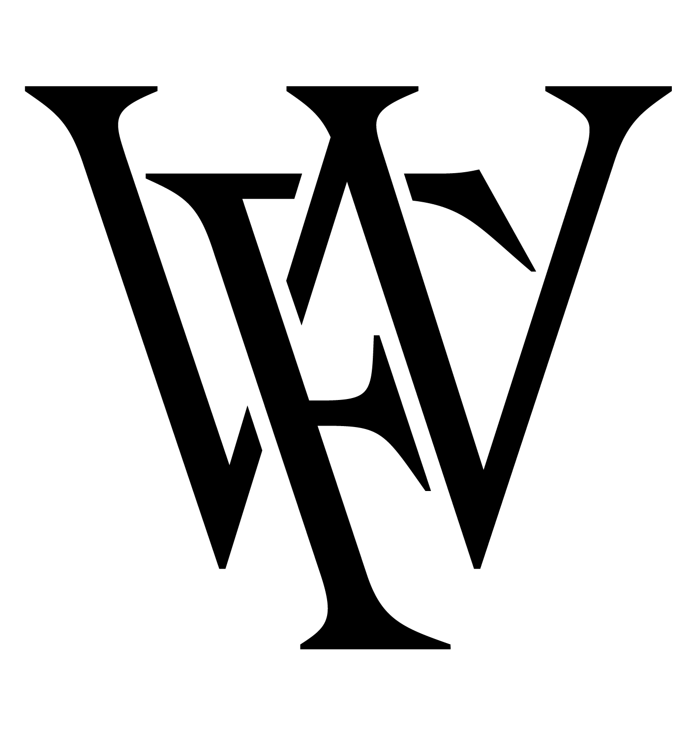
In addition to editorial layout, I also developed two new logos for The Kirkwood Call during my tenure: one from my first year on the publication as a web staffer, and another for my senior year. Both designs modernized the publication's identity while preserving its established reputation within the Kirkwood community.
This project remains a foundational example of my approach to design: blending editorial integrity with expressive, modern visual storytelling.